How to Read a Turquoise Stone Like a Pro (Color, Matrix, Cut)
If you’ve ever looked at two turquoise rings at the same price and thought, “Why do I like this one more?”—you’re not imagining it. Turquoise has a visual language.
Here’s how I break it down when curating for Wildflower:
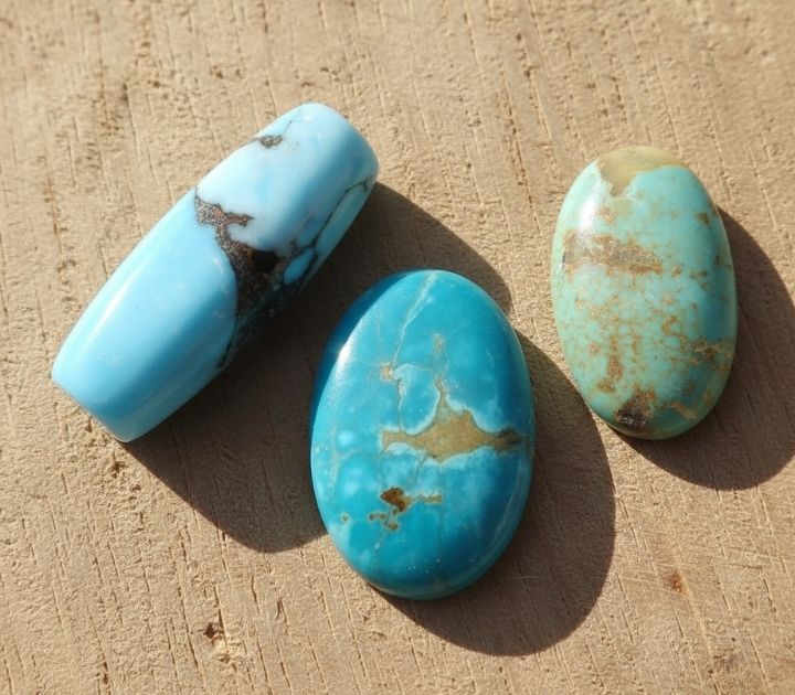
1. Color: Tone + Depth
Color isn’t just “blue vs green.” I’m looking for depth and dimensionality:
Bright blues feel crisp, clean, and airy
Blue-green reads earthy and modern
Deeper greens feel grounded and bold
There’s no “best.” There’s only what you’ll actually reach for in daily wear.

Our stones are sourced from Cutting Edge Turquoise.
2. Matrix: Pattern + Balance
Matrix adds movement and contrast. The key is balance:
I love matrix when:
It complements the stone instead of overpowering it
The pattern feels intentional (even when it’s wild)
The contrast makes the color pop
Matrix is the personality of a stone—like handwriting, no two are the same.

Our stones are sourced from Cutting Edge Turquoise.
3. Cut: Shape + How It Catches Light
The cut can completely change how a stone feels in everyday wear:
High domes feel classic and sculptural
Lower profiles feel sleek and practical
Freeform shapes feel organic and one-of-a-kind
And then there’s the setting—sterling silver, always. The right bezel or band can make a stone feel modern, wearable, and alive.

My “Would I Wear It?” Test
I’m curating for real life, not a display case. Ask yourself:
Does it snag or sit awkwardly?
Does it feel comfortable?
Does it feel like you, not costume jewelry?
If it passes this test, it’s a stone worth keeping close.

Ready to Find Your Perfect Stone?
If you want personalized guidance on selecting turquoise that speaks to you, send us a note at [email protected]—we’d love to help.

Browse our collection or join the VIP list for first access to new stones.
